Learning how to read stock charts is an important basic skill for any investor. You’ve seen a standard stock chart. You know it shows how a particular stock has done over a period of time.
Many investors recognize a ticker symbol and the price of a stock. But beyond that, the rest can start to look like a foreign language.
Being able to analyze the stock performance of a company and identify important chart patterns will give your stock-trading strategies a significant leg up when it comes to building a stock portfolio. When current events, like the coronavirus pandemic, cause the market to spike or drop, knowing that you’ve done your due diligence by becoming familiar with stock charts can provide peace of mind.
In this article, you’ll learn more about why it’s important to learn how to read stock charts, some of the different types of stock charts out there, and how to go beyond stock price to incorporate a bit of fundamental analysis.
Why It’s Important to Learn How to Read Stock Charts

Reading stock charts can feel intimidating and even overwhelming at first. But once you learn just a few basic concepts, you’ll understand the underlying company better. Plus, you’ll be well on your way to identifying winning individual stocks and sorting out the right times to buy and sell.
Stock charts quantify several key items for investors.
Charts Provide Information
Information is power. Charts provide a graphic representation of the price of an investment and how that price has changed over time.
Charts Tell a Story
When you learn how to read stock charts, you’ll see a story unfolding rather than just a bunch of numbers.
You’ll be able to tell when the stock price might be settling down near a bottom point or nearing a ceiling that it just can’t break through.
Charts Are Like an X-Ray
Just like doctors use X-rays to see what’s happening beneath the surface, reading stock charts enables investors to understand what’s really happening with the stock of a company.
You’ll learn how to spot if a stock is being dumped (or scooped up) by large institutional investors and/or managers of mutual funds or exchange-traded funds (ETFs). By spotting such trend lines, investors can use stock charts to identify buy and sell signals.
The information you extract from a stock chart will depend on the type of chart you’re reading and whether you know what you’re looking for.
Different Types of Stock Charts
Since different types of graphs help readers visualize different types of data, there are several kinds of stock charts. Different types of charts will show you different information. Not every investor uses the same stock analysis approach. Which chart an investor uses is driven mainly by simple preference.
Often, these charts will contain some standard information like the company name, stock ticker, and the exchange the stock is traded on. In the chart below, in the top left corner you’ll see the company name, Amazon.com, Inc. You’ll see the ticker AMZN. And you’ll see that Amazon (NASDAQ:AMZN) is traded on the Nasdaq.
Let’s walk through the most common types of stock charts next: line charts, bar charts, and candlestick charts.
Line Chart

Image credit: Yahoo Finance
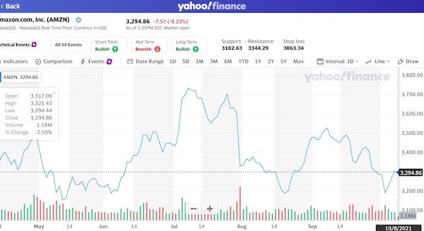
A line chart is a simple place to begin.
Above is Amazon stock’s line chart from Yahoo Finance. You’ll see this graph is charting time along the horizontal axis and the stock’s price along the vertical axis. The horizontal axis can be adjusted to display just about any time period.
Points are added to the chart in real time to show trading at the end of a certain period — years, months, days, or even hours. For example, daily charts will show the closing share price at the end of each trading day.
Line charts are great for visualizing changes in price and quickly spotting volatility.
Often, you’ll see another chart included just below the line chart that will help you visualize the trading volume, or the number of shares being bought and sold in a given time frame.
Bar Chart

Image credit: Yahoo Finance
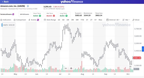
Bar charts will also provide information about price, but instead of seeing a line, you’ll see a bar. Pretty simple so far, right?
The bar provides you with more information about price movement. You’ll see ticks on the bar that represent opening price on the left and closing price on the right. Ticks at the top and bottom, respectively, represent the highest price and lowest price that a particular stock traded during a given time frame.
Some investors think bar charts uncover more insights about stock market sentiment. These investors feel a bar chart displays how bullish or bearish investors are feeling — in other words, how investors are really feeling about potential uptrend or downtrend movement of the specific stock.
Candlestick Chart

Image credit: Yahoo Finance
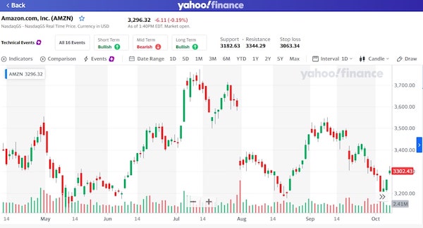
The next type of chart is a candlestick chart. The way this chart displays information is similar to the bar chart. You’re again going to see open, close, high, and low prices. But on the top and bottom of each bar you’ll see what are referred to as “wicks” that make the candle shape.
Depending on how long the wick is and the shape of the candle, investors try to predict future price movement of a stock with various technical analysis strategies.
With a candlestick chart, you’ll know if a stock closed higher than it opened. If this is the case, the candlestick will appear green. If the stock closed lower than it opened, the candlestick will be red. This lets investors quickly gather information at a glance.
Depending on the provider of the graph, you may see green and red like Yahoo Finance displays. Or you may see white and black (or empty and full) candlesticks.
Venturing Beyond Stock Price
Knowing the various types of stock charts and reading technical information about share price changes will only get you so far. It’s important to understand how stock price fits into the bigger fundamental analysis picture and what other metrics are telling you.
Two key considerations when analyzing individual stocks are the price-to-earnings ratio — the P/E ratio — and earnings per share.
Earnings per share, or EPS, is exactly what it sounds like. You can calculate EPS by dividing the most recently reported company earnings by the number of shares available in the stock market. (To get a company’s earnings, subtract the company’s preferred dividends from its net income.)
The P/E ratio illustrates how the share price compares to the EPS. You can calculate the P/E ratio by dividing a company’s current stock price by its EPS. These additional metrics expand your information beyond a stock’s price.
When you’re deciding to buy or sell, it’s important to go deeper and see if the stock price is justified by the earnings of the company. Sometimes a higher P/E ratio can be an indicator that the market is overvaluing the stock.
While there’s no fixed way to measure what qualifies as a strong P/E ratio or EPS, it’s always helpful to watch how these metrics are trending and to look at these numbers relative to those of competitors in the industry.
Taking the Next Step

Navigating today’s market can feel overwhelming. You’re doing the right thing by adding tools and information to your investing arsenal.
With the information in this article, you now know the different kinds of stock charts out there. Plus, you know that stock charts alone aren’t going to be a magic bullet.
This information can help you determine which stocks might be a good fit for your retirement portfolio. For more help finding your way to stocks that might work for you, subscribe to the Investors Alley “Dividend Hunter” newsletter.


