I knew this day would come. Every other investor and analyst did too. But I think most investors and analysts don’t understand what’s happening.

Last week, the yield curve uninverted.
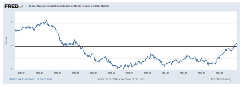
That is likely to be the most significant event of 2024. I know that’s a bold statement. After all, we saw incredible events last year, including a presidential election filled with twists and turns no one saw coming.
It’s been so long that the yield curve was a story that you may have forgotten about it.
The curve is the difference in interest rates over different time horizons. The chart above shows Treasury yields—specifically, it shows the difference between 10-year notes and 3-month bills. This is one of the most widely analyzed relationships in the yield curve calculation.
The ten-year minus two-month spread is also widely analyzed. It tells the same story: that spread uninverted in September.
The yield curve is usually uninverted, meaning long-term rates are higher than short-term rates. That makes sense: there are more risks over ten years than three months. Investors should be paid more for accepting that risk. The interest rate pays investors for risks; therefore, the long-term rate should be higher than the short-term rate.
Sometimes, the yield curve inverts. That means short-term rates are higher than long-term rates. This is rare as the next chart shows.
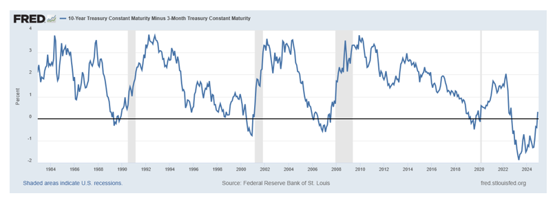
Inversions have happened five times since 1980. On that chart, grey bars highlight recessions. You may notice that there were four recessions during that time. If you look closely, you may also notice that recessions occur after the curve uninverts and returns to normal. That’s where we are today.
We can see this on the chart, but we can also test this idea: The yield curve has uninverted 27 times since 1980. There are a number of whipsaw trades with this indicator. One month later, the S&P 500 was higher just 44% of the time. The average annualized return in the month after the uninversion is 0.4%.
Over three months, that bearish bias remains in place. The S&P 500 was up just 53% of the time after the uninversion. A random entry will have a win rate of about 60% over three months. The annualized return over those three months is 0.1% while the index annualized return is 7.0%. A year later, the win rate for this signal is 64%. The average annualized return is about 0.1%.
This is important news for investors, and I am surprised it’s not in the headlines.
The yield curve provides information about the economy. The fact that the curve turned positive after a 26-month inversion tells us that the economy in 2025—and most likely 2026—is likely to be different than it was in the past two years.
Previous instances have been followed by spikes in inflation and recessions.
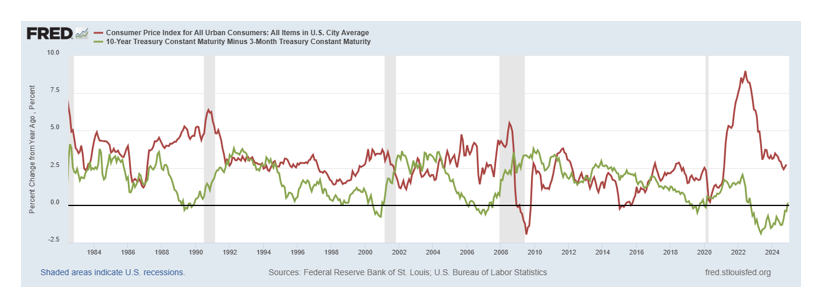
It’s not a pretty picture.
Last week’s uninversion tells us to expect bad news on the economy and lower-than-average returns in the stock market. In fact, we should be looking at our investments with a bearish bias and we should be defensive to protect the gains we enjoyed in last year’s bull market.
